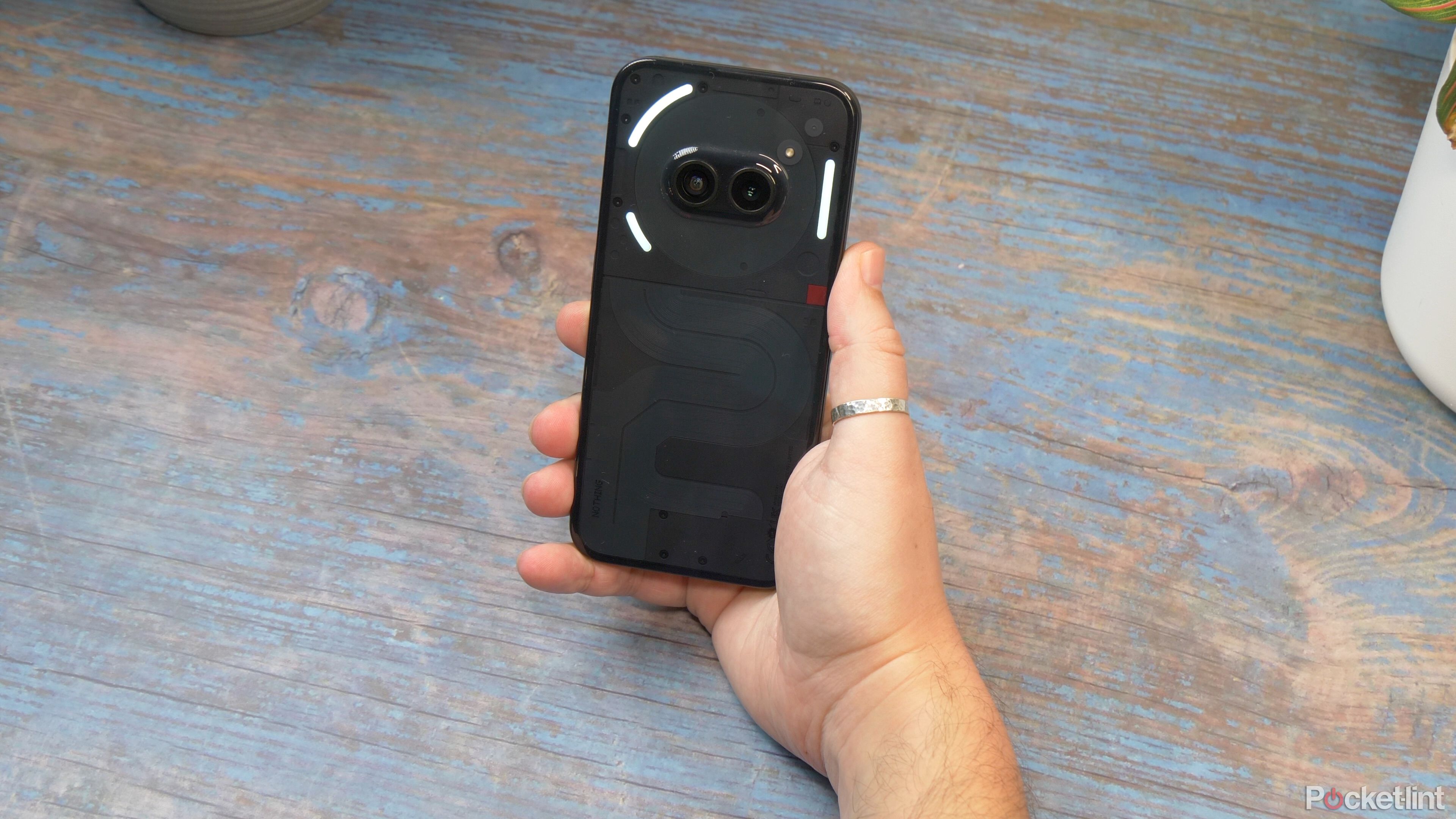
Nothing’s approach to tech has been refreshing — to say the least, especially when it comes to the mid-range, affordable smartphone market. If nothing else, it’s nice to see a company doing things differently. In fact, in a lot of ways, I think the Nothing Phone 2a — with its price tag of around £320 in the UK and $350 in the US, but only as a developer device — is a much better value proposition than what many regard as the best mid-ranger, the Pixel 7a.
Nothing Phone(2a)
Great, for the money
- Cute, purposeful design and attention to detail
- Brilliant, big display for the money
- Unique software icons, styling and widgets
- It’s smooth, powerful and has great battery life
- Cameras are a bit of a weak point
- Plastic build won’t be to everyone’s standards
- Glyph lights are a nice novelty, but largely useless
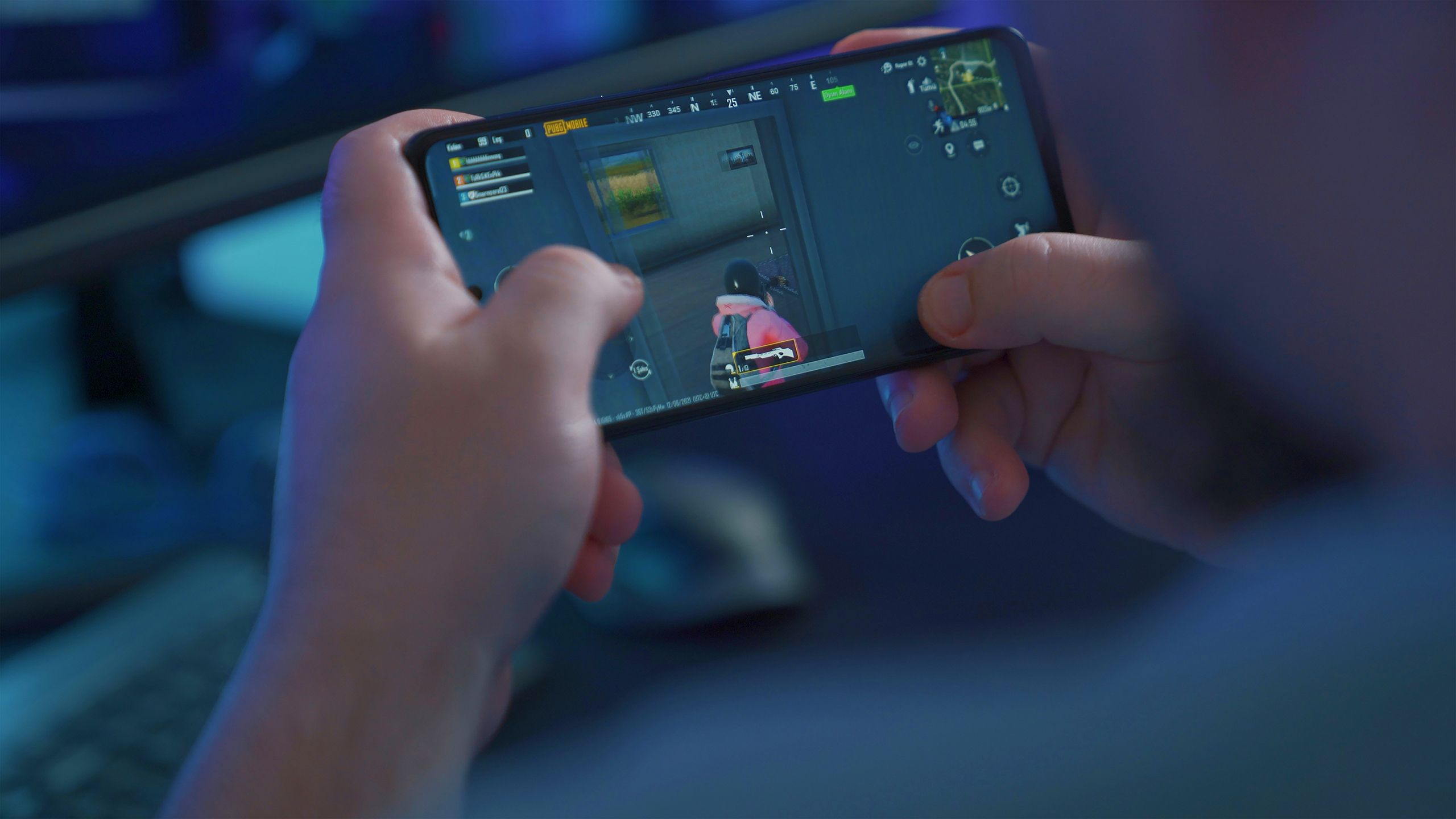
10 addictive games to play on your Android phone or tablet
The quality and quantity of Android games available in the Play Store have never been better, but these ones make it hard to put your device down.
Pricing, availability and specs
The Nothing Phone(2a) launched on March 5, 2024, and will be widely available in Europe. It’s £320 in the UK, with either 8GB of memory and 128GB of storage, or with 12GB of memory and 256GB of storage. It’s available in the US for $350, but only through Nothing’s developer program for those developers who want to build applications or integrate with Nothing’s Glyph interface.
Nothing Phone(2a)
- Brand
- Nothing
- SoC
- MediaTek Dimensity 7200 Pro 5G
- Display
- 6.7-inch AMOLED, 1084 x 2412, 120Hz, 1300 nits
- RAM
- 8GB / 12GB
- Storage
- 128GB / 256GB
- Battery
- 5,000mAh
- Ports
- USB-C
- Operating System
- Android 14, Nothing OS 2.5
- Front camera
- 32MP
- Rear camera
- Dual 50MP, Main and Ultra-wide
- Connectivity
- 802.11ax Wi-Fi 6, Bluetooh 5.3, 5G
- Dimensions
- 161.74 x 76.32 x 8.55 mm
- Colors
- Black, milk, white
- Weight
- 190 g
- Charge speed
- 45W
- IP Rating
- IP54
- Price
- 350
Doing things differently
Mid-range affordable approach
One of the things I really like about the Nothing Phone 2a is that its approach to this mid-range, affordable segment is quite different to most other smartphone makers. Because most, like Samsung, Motorola, OnePlus and others — when you’re looking at the low end of the mid-range market — don’t tend to put the same emphasis on attention to detail.
And this is seen most obviously in the design of the phone. Look at it head-on, side-by-side with the more expensive Pixel 7a, and you’ll see what I mean pretty much immediately. And it’s all about those bezels around the display.
Not only are they thin, but they are completely uniform in thickness all the way around the four edges. And the radius of the curve matches the curve on the outside of the phone.
Look at any other phone in this price range — and even higher — and you’ll usually find the bottom bezel is noticeably thicker, and that the corners don’t quite match. And that’s not just true of mid-market devices, there are flagship phones without this uniform, purposeful approach to design (Hi Google).
Plus that fact that it’s not all that heavy — despite being a large phone — and it’s a device that’s a pleasure to hold and use day in, day out. I’ve been really impressed by it.
8:40
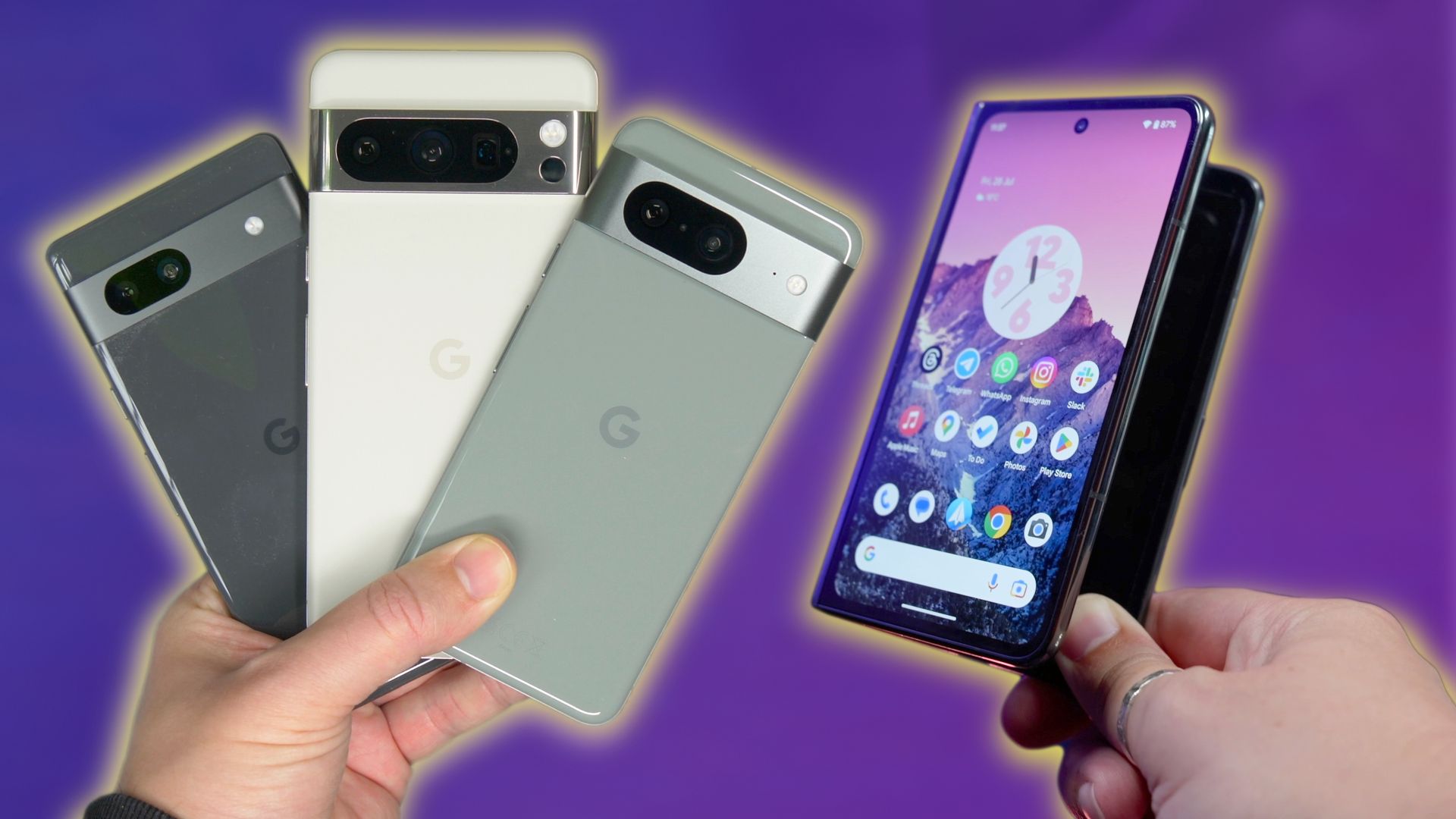
Best Google Pixel phones: Expert tested and reviewed
Not sure which Pixel phone is the right one for you? Here’s a breakdown of every model Google offers.
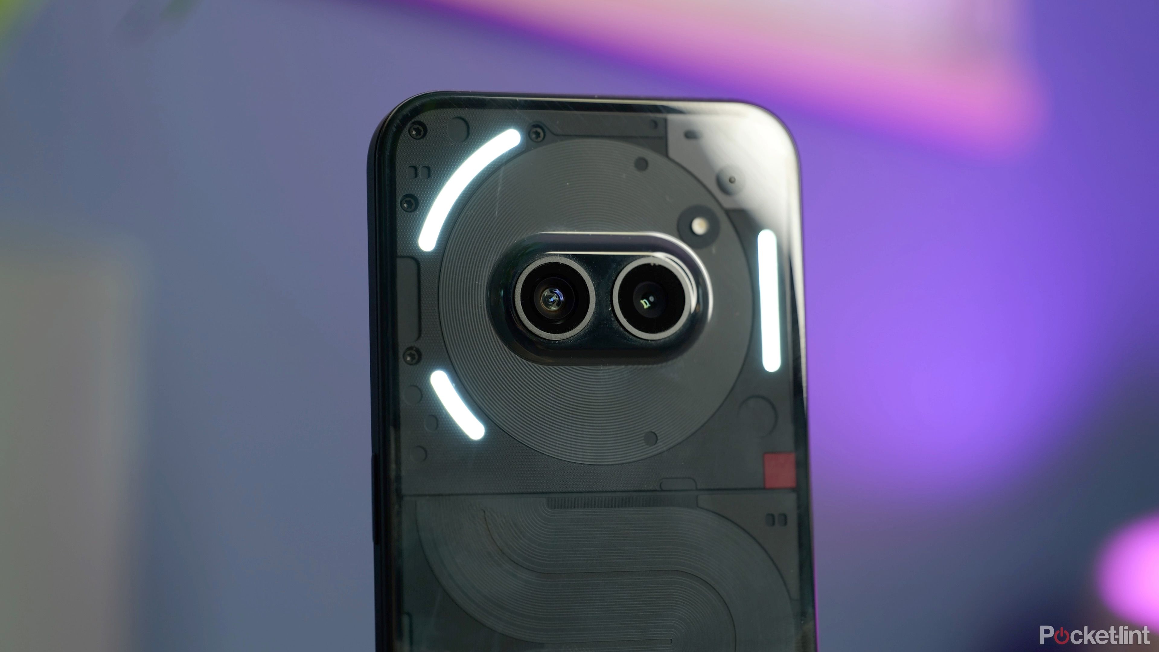
On the back, you get what’s almost like a playful character. The top third with its centrally placed cameras looks like cartoon eyes on the head, with the bottom two-thirds almost like a body. Here, while different, the Pixel 7a does have similar design strengths. It’s not playful, but the Pixel design is minimalist, strong and purposeful. And it has that sturdy aluminum mid-frame that adds a sense of rigidity to the feel and durability. It’s also water and dust resistant to a much higher level.
You get splash resistance from Nothing’s smartphone (and it is dust tight), but I’d definitely resist the urge of dunking it in water for any extended period of time.
The other thing I found — surprisingly — about the Nothing Phone 2a, was that, despite being made from plastic on the back and the sides, it actually feels good. The edges feel sturdy enough, and have a texture to them that’s not too smooth and not too rough, providing good grip on the handset, while the buttons are nice and clicky.
With that, plus that fact that it’s not all that heavy — despite being a large phone — and it’s a device that’s a pleasure to hold and use day in, day out. I’ve been really impressed by it.
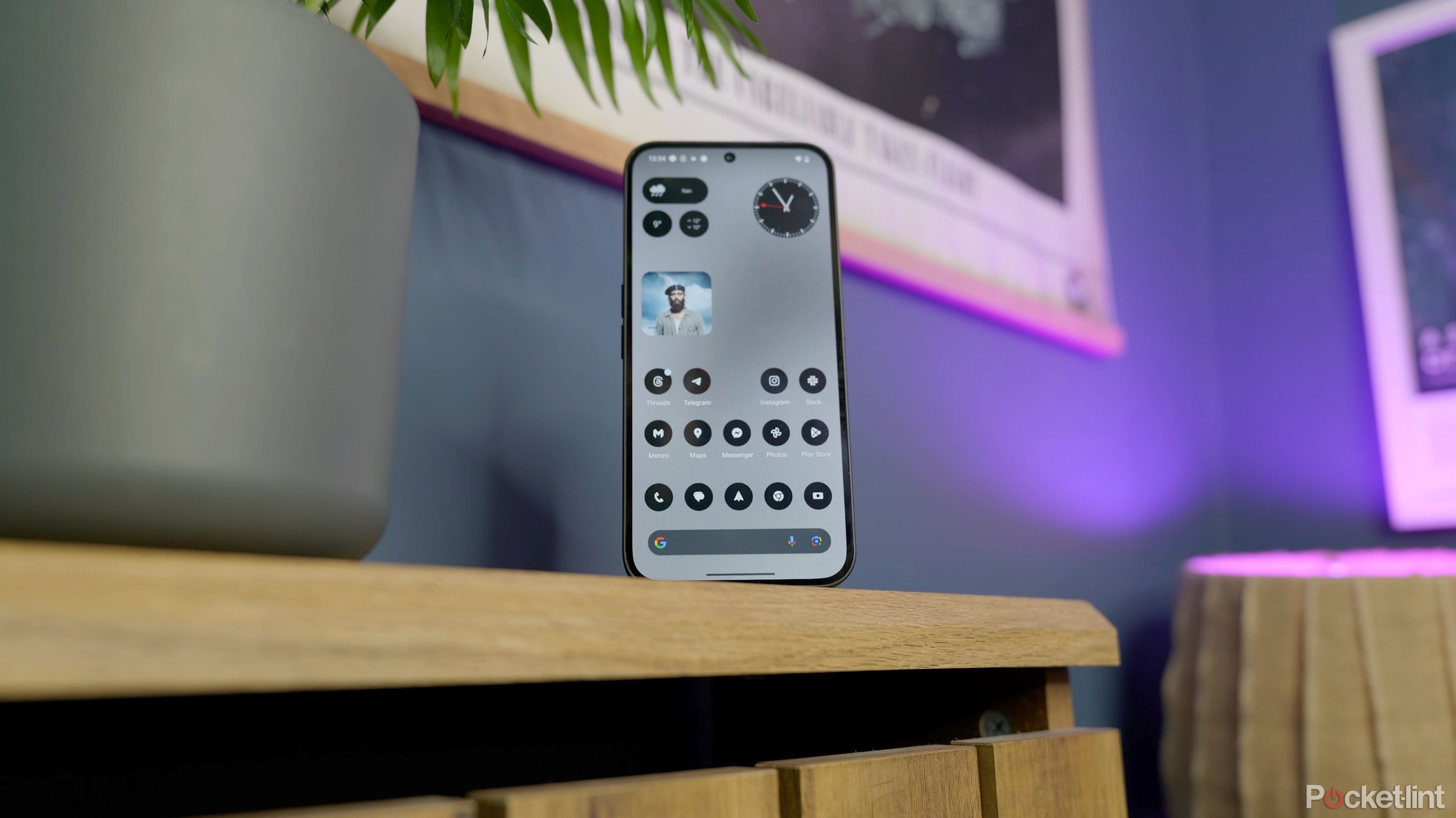
LED Glyph is fun and unique, but not incredibly useful
Then — of course — there’s that collection of LED strips on the back. No longer covering the entire rear of the phone, the Glyph light area is smaller, but almost as customizable. You can have them flash for notifications, and customize ringtones and Glyph patterns to match your preferences. You can even have them flashing in time to any audio playing on the phone.
As cool and unique as they are, it’s not something I found much use for. I’m not someone who has their phone face down on any surface — I just don’t want to risk the screen getting scratched — and so the lights are rarely facing me, so they don’t attract my attention all that much. You might be different, but to me, they’re more of a novelty feature than an essential one.
 Where it really stands out
Display quality and size impresses
While the design shows attention to detail, there’s one area I think the Nothing Phone 2a really stands out in this affordable market, and that’s the display. At 6.7-inches, it’s pretty large and has enough pixel density from its full HD+ resolution screen that it looks nice and sharp at the usual arm’s length. That’s a good start, but it’s not the only quality that makes it impressive. Again, looking at it side-by-side with Google’s more expensive Pixel 7a, I noticed the quality of the panel was much better in a few ways. First, it doesn’t suffer from the same level of color shifting as the Pixel when viewing it from an angle. So you don’t get that subtle rainbow effect.
Switching from the 120hz on the Nothing phone to the 90Hz on the Pixel, I could see the smoothness and sharpness was better [on the Nothing phone].
Second — its refresh rates are much smoother. And this is something I noticed mostly in the general user interface. Switching from the 120hz on the Nothing phone to the 90Hz on the Pixel, I could see the smoothness and sharpness was better. It may not be the absolute pinnacle of LTPO technology, adjusting refresh rates at increments as small as the top tier smartphones, but it’s definitely smooth and adaptive enough to make everything feel fluid and responsive.
It also happens to be really bright too, compared to a lot of other similarly-priced smartphones. With a high brightness mode peak of 1100 nits, it’s pretty easy to see it outdoors even in bright daylight. Its HDR peak is 1300 nits which — a couple of years ago — was about what you’d expect on the most expensive phones, and it means the phone is capable of displaying HDR10+ content.
Software that sets it apart
Throw-back fonts, themes, and widgets
One area Nothing has been keen to differentiate itself from everyone else is in software design. It has minimal, retro font styles and a mostly monochrome color scheme with a splash of red, making it distinctive and unique. There are things to like, and things that need improvement here. I love the collection of widgets on offer, for things like the clock and the weather.
There’s also a music widget you can have on screen that shows the album art of any music currently playing. It effectively uses the same tech that the music playing widget uses in the drop-down notification shade whenever you have music or media playing. So it’ll work with most music apps. But you can tap it to play and pause music, making it an interactive widget.
I also really like the customization of folders, where they can be resized and given their own icons, which is pretty much necessary when you’re using the Nothing launcher icon pack. With most of those being black and white, and so many apps without Nothing versions of their icons, you’d end up with a weird mix of monochrome and original color icons otherwise.
Nothing is still a little behind on software support commitments compared to the big-name flagships though. But comparable to similarly priced phones. It’ll get three years of major updates, taking it up to 2027. Pixel’s 7a as a comparison will be supported up to at least May 2026.

Samsung commits to 7 years of software updates, starting with the Galaxy S24 series
Samsung joins Google to deliver more security and Android OS updates than ever before.
Strong performance and battery life
As I’ve mentioned, the feeling of fluidity and smoothness is real with the Nothing Phone 2a. And it goes to show that you don’t actually absolutely need the top tier flagship processor in order to get a phone that feels responsive and quick.
In games that have high graphical demands, what I found was it would slightly reduce resolution in order to keep the game play smooth, ensuring that frame rates don’t drop.
Inside this phone there’s the Dimensity 7200 Pro, a tweaked chipset designed in collaboration with MediaTek, and one that’s got plenty of oomph behind it to make your casual games easy to play.
In games that have high graphical demands, what I found was it would slightly reduce resolution in order to keep the game play smooth, ensuring that frame rates don’t drop. A rally racing game I like to play — for instance — was set to 720p, but with all other graphic settings like shadows, particles and other details set to ‘Ultra’ settings and frame rates set to a 120fps target.
So if you play Call of Duty, or games like Genshin, you might find details aren’t completely pin-sharp, but the smoothness doesn’t tend to drop. I didn’t see much in the way of stuttering or lag, which is great on a phone at this price.
Pixel 7a was similar, although I did feel the Pixel got a bit warmer to the touch in gaming sessions, or using the camera, compared to the Nothing Phone.
Similarly, the 5000mAh battery is more than good enough to get me through a full day. In fact, it’s really strong. With my own moderate to light usage, which is a mixture of social media, video watching, browsing and casual gaming for about 2–3 hours in a day, I’d easily finish the day with around 40-45% left over, meaning it’s not far off being a two-day battery. Pixel wasn’t close to that, usually ending with around 30%, and definitely not a two-day phone.
Plus, with the 45W charging speeds — it can be refilled again relatively quickly. You’ll get a full recharge in about an hour, or a 50% charge in 23 minutes. There’s no wireless charging though, which is one area the Pixel 7a offers more.
A camera experience that’s a little all over the place
Where things start to swing in the Google Pixel’s favor is in the camera department, and not just because of the results, but what it’s like to use the camera itself.
One thing I found consistently on the Nothing Phone was that things just happen in a delayed fashion. Switching between the ultrawide and main cameras, or tapping the 2x zoom button, resulted in a slight delay, as did pressing the shutter button to capture a photo or a video.
Pixel’s phone handles those changes a little quicker, although there is a slight jump when changing lenses. The other thing I found was that the Pixel results were just a bit more consistent across both lenses. If you want to see side-by-side comparisons of the Pixel 7a’s camera, make sure to check out the video at the top of the review.
I often found the Nothing phone would push the contrast and exposure higher with the primary camera and its 2x digital crop — giving images sometimes quite a harsh look, especially if there are bright sources of light in the frame. It would usually be far more saturated too, giving colors an over-rich look that wasn’t entirely natural.
Still, for a phone in this price range, it tends to cope well when there’s lots of light in the scene. It can focus pretty closely on objects too, so you don’t need to be too far away to get an in-focus shot. Tap the 2x zoom button, and you’ve got yourself a shot that can pass as a macro photo.
In scenes indoors or in lower light situations, you can tell it struggles to retain detail and perhaps is disguising that with the increased contrast and color saturation. In fact, indoors in daytime, it wanted to kick automatically into night mode, even though the light levels were still relatively decent.
As for video — here’s somewhere the Nothing Phone could definitely improve. Not only does it only go up to 30fps when shooting 4K, I found that it also suffered a little from the rolling shutter effect, so when combined, if you’re panning quickly — or even not so quickly — in any scene, the Pixel footage comes out looking lots smoother. Nothing’s video is a little stutter when the camera is moving.
Verdict: do I recommend the Nothing Phone (2a) for value?
Taken at face value, it’s hard to imagine a better looking, better designed phone for the money than the Nothing Phone 2a. And it has the display, performance and battery life to match, combining to create what I think is the best overall phone experience for the money.
It has the display, performance and battery life to match, combining to create what I think is the best overall phone experience for the money.
Nothing Phone(2a)
Recommended
It’s not perfect — the camera is a little bit of a weak spot and something that could definitely be improved — especially when comparing it to Google’s ‘a’ series phone. But still, the Pixel costs more, has a poorer display and poorer battery, so as long as you’re okay with a camera system that’s decent, but not brilliant, there’s so much right with the Nothing Phone. It’s won me over.
Trending Products
Cooler Master MasterBox Q300L Micro-ATX Tower with Magnetic Design Dust Filter, Transparent Acrylic Side Panel…
ASUS TUF Gaming GT301 ZAKU II Edition ATX mid-Tower Compact case with Tempered Glass Side Panel, Honeycomb Front Panel…
ASUS TUF Gaming GT501 Mid-Tower Computer Case for up to EATX Motherboards with USB 3.0 Front Panel Cases GT501/GRY/WITH…
be quiet! Pure Base 500DX Black, Mid Tower ATX case, ARGB, 3 pre-installed Pure Wings 2, BGW37, tempered glass window
ASUS ROG Strix Helios GX601 White Edition RGB Mid-Tower Computer Case for ATX/EATX Motherboards with tempered glass…
